Principles of User Interface Design


Principle is considered a rule that must be followed and respected. Is an concept that contains certain goal. the Principles of User Interface (UI) Design
are considered guidelines that help design and develop a successful interface.

User Interface design contains some techniques like structure , Tolerance, simplicity etc. These help the interface look professional and well designed.

The web design which I choose to apply and explain these principles is Apple Canada one of my favorite interfaces, and these principles are very well represented in this interface.

I will explaining each principle, and if this principles were properly used in the design.

NUIT BLANCHE BOOK

Image

NUIT BLANCHE BOOK

This is another project that would make part of my portfolio. One of my favorites projects in Graphic Design program. This book was created in the Winter of 2012, and the main project was to attend to this event ( Nuit Blanche ) This event takes part of Toronto one night of the year. Where you can enjoy of music, art, technology, dance for a complete night. We went to take pictures of this Festival; and we had to brought all the best photos into a book where typography was important too. We also had to explain the pics and the place where it was taken. One night of art, photography and a perfect environment.

TOYOTA ( Mock-up )

Image

TOYOTA ( Muck-up )

The objective of this project was to remake or redesign a web design. I used Toyota for this project because personally I think their web design is not that stronger and well designed to be one of the biggest companies in the world. I did not changed lots of content. I just wanted to make this more visual, consistent, and align the font chosen ( Gotham ) is clean and make it work better. Also; the colors used represent the brand of the company too. It was and nice project: however, It was not that easy to remake it, but after lots of thumbnails and design. I think, the results were great.

Shakespeare Poster.

Image

Shakespeare Poster.

This poster was created for the 3rd Annual Toronto Shakespeare Festival. The Objective was to create something brilliant and impactful for the viewers. I used one of his famous plays the tragedy of Julius Caesar. I wanted to make it visual and understandable that is why I applied to this some images related with the time and the play. The type was perfectly used and aligned to make is more visual.

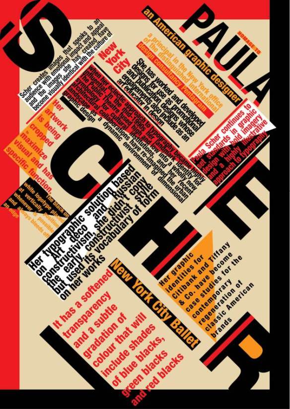
Paula Scher

Image

Paula Sher

Paula Scher begun her career as Art Director for CBS records, where she designed posters, ads and over 150 album covers a year. In 1991 Scher joined Pentagram as Partner, developing identities, packaging and signage for a variety of major clients including The New York Times Magazine, Bloomberg, Target, Jazz at Lincoln Center, Madison Square Park, Tiffany & Co., Citibank and The Public Theater.

My Career Plans.

My career plans:

My goal as a Graphic Designer is  to create, or have my own studio. My own design firm or company; however, I know and understand it takes time to do it, and It is a process which I should follow and respect.

On my road or process , I would be very interested in work with any other companies learning and getting all the knowledge possible. I’ve reached some nice companies I’d like to work for, such as, Swerve Design, Ink, Atom Design Collective, Doug  & Serge, Fiver Design etc.

Interactive Campaign: I would like  to be involve in a project where the creativity and design are the most important. I’d like to be behind the design and animation some of my strongest skills. Companies like BMWNike, Coca – Cola, Angry Birds. Their creativity and design are unique and the interactive campaigns are brilliant.

The ideal work environment and type of work I am interested in:

  • Job near my place
  • Clean smelling air
  • Big Room with lots of white space
  • Music that isn’t that loud, or Justin Bieber
  • Access to natural light
  • Artwork and inspirations on two walls
  • Access to clean and cool drinking water (Potable).
  • Coffee isn’t a must have for me. Since I don’t drink it.
  • Oh! And white paper and pencils.

Some of my  favorite and inspirational designers:

http://www.fromupnorth.com/best-of-2012-graphic-design/
http://www.vignelli.com/
http://www.herbertmatter.net/home.html

“Everything is designed. Few things are designed well”